Showing posts sorted by relevance for query billboard. Sort by date Show all posts

Friday, December 3, 2010

Colbert's White Wail and a Billboard Critique

The first time I saw the Colbert Report almost five years ago, I disliked it. I don't remember if I didn't get the joke (of course I hate to admit that's even possible now), or just didn't like the fake stridency. I didn't watch it for very long before turning it off.

I still think the show is an acquired taste, and it's challenging to watch much of the time. It assumes a lot of knowledge of the pundits Colbert is parodying, as well as the events he discusses. But in a time full of outrageous stories, parody is sometimes the only possible response.

As was the case on last night's show when he took on white privilege in the context of the recent Congressional vote for compensatory payments to black farmers and native tribes.

The Colbert ReportMon - Thurs 11:30pm / 10:30c
The Word - The Great White Wail
www.colbertnation.com
Colbert Report Full Episodes2010 ElectionMarch to Keep Fear Alive

The second segment of the show focused on the story of American Atheists' billboard on the New Jersey side of the Lincoln Tunnel:

Blue billboard with white type, You KNOW it's a Myth with three kings, Mary and Joseph in manger under star
Colbert noted that the Catholic League has responded with its own billboard on the other side of the tunnel:

Red and green billboard reading You know it's real, This season celebrate Jesus
Catholic League president Bill Donohue described the second billboard as a "counter-punch" to the atheist billboard, to which Colbert replied: "Just like Jesus says, if someone slaps you on the cheek, counter-punch!"

My comment on the two signs is that the atheist design badly lags the Catholic billboard (despite their use of an all-white holy family).

Atheist billboard with design elements called out for critique
Here's my quick attempt at a design modification, ditching the Koch Antiqua font in favor of a sans serif that's more readable at a distance. I changed all the words to sentence case to simplify it visually, and made the one word they really wanted to emphasize (know) bold instead of all caps.

I've also decreased the size of the three kings and their camels to allow more room for the type and moved the star just a bit.

Revised You know it's a myth billboard

I guess the original design could have been worse, though. It could have been typeset in Papyrus.

Thursday, February 2, 2012

Wrong Place, Wrong Kind

Imagine you're driving down a stretch of urban interstate and you see this billboard:

Lavender billboard with a cartoon hammer and the word Hammered?
What would you think it was for?

Unconsciously processing the cheery, script typeface and happy-faced tool, I had the vague idea it was for a home handyman service or a contractor. (Maybe one owned by gay men, since the background is lavender.)

Nope.

Close up of the billboard showing it's for a cab company, looking for business from people who are drunk
Keep in mind the traffic is going past at 55 to 65 miles an hour most of the time, and the billboard is not even right next to the highway. That type is completely unreadable, except the word "Hammered" and the phone number. (I got off the highway onto an exit ramp to take the photo, and even then it wasn't all that close.)

Not to mention that if you're seeing the billboard, you're already in a car, given that you're on a highway. Does the cab company think drivers are going to memorize even a simple phone number on the off chance they're drunk some other time and want to call a cab? I could understand this billboard if it were redesigned a bit and put somewhere that people are already likely to be drinking, but on an interstate?

And maybe it could have a different background color... maybe something like blue to reinforce the name of the company? Just an idea.

Shot at I-94 and Cretin Avenue in St. Paul.

Friday, April 7, 2023

Bad Billboards

Highway 280 in Saint Paul must be the ugliest highway in the Twin Cities, and that's saying something, since highways are generally ugly. Part of the reason it's so ugly is because it's over-ful with billboards, and of late, it seems as though those billboards have gotten more and more badly designed. 

Between University Avenue and Como Avenue, heading north, there are seven billboards, and not a single one of them is what I would call good. Only three of them are even readable, and of those one isn't really understandable. I'll group them from best to worst.

The best ones are not good:


The headline is readable, but the type along the bottom is not. Maybe that doesn't matter, as long as you know who Tom Barnard is. (I am not the audience for this billboard, however.)

Probably the best one, overall. It follows the rule of minimal words, gets the point across, and has a snazzy graphic, too.

This one has nice design, but the nice readable DEAN'S DOES type doesn't tell you what Dean's does. The designer left that for the low-contrast red type on a blue background: one of the worst color contrasts there is. A driver moving past at 55 mph or more cannot read that, let alone the tiny white type at the bottom. I still don't know what that part says.

The worst billboards are even worse, though:

I know this photo is bad, but the billboard is bad as well. Sure, you can read the phone number, and maybe that's enough. But the two guys in suits and the phone numbers is really all you get from it at 55 mph. And the color red.

Obscured behind a power line, I think this one may be a PSA. I have no idea what it's about. The headline is about reminding you to do some kind of checkup or change your smoke detectors or something... but that part — the real content! — is tiny, so I don't remember what it was. The too-long, not very clever part in the funky typeface at the top says "IF YOU SMOKED WHEN MONITORS WERE ALL MONOCHROME."

Here's another one that's a mystery to me. I have no idea what this billboard is for. A real estate service of some kind, maybe? Why would anyone bother to check into it from this billboard? And the tiny type below the headline might as well not be there.

Finally, even without my blurry photo, this is the worst one of all. Four lines of all-caps, tightly stacked extended type. And the words are not clever, so they're not worth struggling through. Then there's a logo at bottom right that I don't recognize or connect with anything. Some kind of crypto? Oh geez, get me out of here.

These businesses are paying at least a thousand dollars per month for these things, maybe a lot more given the highway location. I don't understand why they can't spend a little bit more money putting something onto them that actually makes it worth their expenditure.

__

I apologize for the bad photos; it's hard to take photos of billboards while going up a highway, even if you aren't the one driving. 

__

Here's an example of a local billboard done right from one of my past posts.


Friday, November 21, 2025

Test Your Pee for Hidden Heart Risk

Highway 280 in Saint Paul is lined with billboards, some of which I've written about before. Currently, there's a billboard on the east side (northbound) that probably has the worst design of all time. 

There's an unwritten rule about billboards: they shouldn't have more than seven to 10 words at most. And I would add, their visual elements should be clearly understandable to the viewer. 

This photo is slightly blurry (my apologies) but even if it wasn't, that wouldn't help much:

I've been trying to figure out what this billboard image is for weeks when I drove past, or even what the words say. After a few tries, I figured out it had something to do with kidneys and getting tested for something, but until I took this photo and squinted at it, I had no idea that:

  • The red stuff in the middle is red smoke sent up from a flare, held by a hand at the bottom center of the billboard. We had speculated they were flower petals, or maybe blood.
  • The first line of centered type says (I think! I still can barely read it) "For those with high blood pressure or type 2 diabetes"
  • The slightly more readable reversed white bars say, "Are your kidneys sending an" and "for hidden heart risk?"
  • In between the two white bars are the partially obstructed letters SOS, with a cutesy heart in the letter O. Because there has to be a second heart to go with the larger smoke heart (you know, the one you couldn't tell was a heart in the first place).
  • Then there's "Talk to a doctor about the uACR* urine test" down in the dark reversed bar near the bottom. Now that's a memorable name for a test. Once I realized that wording referred to a test, I've tried to remember the test's name several times and never managed it. 
  • Finally, I only realized there was a little logo for "Detect the SOS" at bottom right and the name of a drug company, Boehringer Ingelheim, at top left when I looked at the photo. I never even noticed them while I was trying to decipher the many main parts of the message.
  • At bottom left is something I still can't read, just above the dark bar across the billboard. There's also some tiny type at bottom left, below the dark bar. Maybe that relates to the asterisk after the name of the uACR test. Lawyers must have insisted on those, since there's no way anyone could possibly read them. 

And isn't it so great how they wasted so much space on empty blue sky, while cramming all those words in too small a size into the center of the billboard?

For those wishing to count, there are 20 words in the four parts of the main headline, and nine words in the "talk to your doctor" call to action. I have no idea how many words are in the two other small lines.

Tuesday, October 12, 2010

No Mime Needed

Dark billboard with a mime in a white shirt that says LIVE UNITED. Headline says I dream of teaching people job skills but no one seems to want my skills. Followed by the United Way  logo
The first time I saw this billboard while driving along a highway, I slowed down to about 40 mph in order to figure out what the heck it said.

Maybe that could be considered an effective design since it got my attention, but I don't think so. It's more likely to cause car accidents than inform anyone about the United Way.

There are so many things wrong with it!

First, there are 15 words in the headline. Two on the shirt. Five more in the tag line, plus two in the logo. That's 26 altogether, when the general rule for billboards is under 10 words.

And what's with the mime? Does anyone take advice from a mime? Are we supposed to identify with his lack of useful skills? Did someone think this was funny? Really?

Worse yet, his black sleeves disappear against the dark purple background. This leaves the white-gloved hands -- turned to unidentifiable flipper-like objects by the way their fingers are hidden by the angle -- as ambiguous floating shapes, tilting off of armless shoulders.

The "Live United" slogan itself seems a bit off to me. Live is one of those words that should be avoided in slogans, since it can be read as either rhyming with give or dive, and readers have no way of knowing which is correct until they've read it through once. And even then, I'd argue the slogan is a bit ambiguous.

A much more effective billboard would have used just the tag line and the logo:

Billboard redesigned to say just When You Can't Do, Donate. with United Way logo
No great shakes from a design standpoint, but it sure scans a lot better when you're driving down a highway.

Monday, April 16, 2012

Too Young to Scope

This billboard is currently adorning the westbound side of I-94 in St. Paul:

Photo of a billboard reading Embarrassment can't kill you. Colon cancer can, juxtaposed with a photo of a woman's butt
It's a little hard to tell what's going on in the image when you zoom past at 55 miles per hour, but with repeated viewings I finally realized that it's supposed to be a woman whose skirt has gotten stuck in the waistband of her underwear, revealing her right buttock for all in the office to see.

Ho hum, another attempt to use a woman's body to to sell something, even if it is cancer detection.

Closeup of the woman's backside, showing the youthful shape of her body and taut skin
But wait... how old would you guess the model in this photo is? 20-something? 30-something?

Definitely not 50-something, right?

Which is the earliest age colonoscopies are recommended for, unless there's a genetic history of early-onset cancer.

So not only does the billboard use skin to get your attention, it misinforms you at the same time. Great. Sounds like a real public service.

Sunday, January 24, 2016

No Stomach for Billboards

Billboards, as I've said several times before, can only have a limited number of words and shouldn't rely on an unclear concept. There's no time for drivers to read much or figure out what an obscure image is. So putting up a billboard like this one should be a waste of money:


Yet, this artwork is currently standing in at least two locations: along Franklin Avenue in Minneapolis near 35W and just off 494 on Central Avenue. "What a waste of money," I said to myself when I saw it on Central the other day. What is that a picture of, what is LINX, and why would anyone think this billboard is effective?
Well, it's not directly effective, but the sponsor and their PR firm hit paydirt when they parlayed these badly designed, obscure billboards into a large story on the front page of last Sunday's Star Tribune business section. That "earned" coverage made the whole thing worth it, I imagine.

By the way, I think the weird image inside the stomach shape is a photo of a person addressing Congress, overlaid with welding sparks. Or maybe it's someone performing in a theater. Not that anyone seeing it for half a second while driving past would ever figure that out. And I didn't even notice there was a web address on the billboard until I saw it in the Strib photo.

Good job on giving them the attention they wanted, Star Tribune.

Friday, September 20, 2013

More than a Silly Billboard

I thought this post would be just a picture of a funny billboard I saw in Minneapolis:


But it turns out there's more to it than the odd juxtaposition of models and Christ. AMTC, it sounds like, fits into the my sucker born every minute category best.

Here's how it works. Prospective models come for a two- to four-hour audition/religious lecture, held as an advertised special event at your local convention center or similar location. Then the "best" applicants are asked to attend a conference that costs up to $5,000 (not including travel, hotel, or food).

Let's guess what "best" means and how hard it is to get invited to that conference. Probably not too hard, I would predict. The complaints about AMTC verify my suspicion.

And get this. They even a registered a domain name called AMTCscam.com to head off griping. (The is not active, but the domain is owned by Carey Lewis of AMTC, according to a whois search.)

I was intrigued by the .org address shown on the billboard, and it turns out that AMTC does indeed have 501(c)3 status with the IRS.

So it's a scam for Jesus, set up to line the pockets of crooks. And it's tax-exempt to boot.

Wednesday, October 31, 2012

A Saint Paul Sight

Possibly only in Saint Paul could you see this billboard:

Billboard for lawyers with headline Injured? Raug Mob?
In case you aren't aware, Raug Mob is in the Hmong language. Minnesota, and Saint Paul in particular, has the largest Hmong population in the U.S.

I have a general familiarity with the language, but this billboard still brought me up short for just a second. I think it's because Mob is a word in English as well.

If the translation had been in a different writing system -- say, Thai or Cambodian -- I don't think I would even have paused. But the Hmong had no written language before the last 50 years, and so their words are written in the Latin alphabet.

Sunday, May 19, 2013

Designers with Their Heads Up Their...

The Minnesota Department of Health has been running this billboard for a little while.


It got some news coverage because some people find the photo distasteful. I don't care about that; my problem is that I find the photo hard to read.

It's unintelligible enough because it's so contrived, but the designer made an even bigger mistake when s/he chose to use a dark background. Because the man is wearing dark pants, his legs disappear into the background and the reader has even fewer cues to indicate the action that's portrayed.

This is the best photo I could get of the billboard, even though I got off the highway, as close as possible, and got out of the car to take the shot. Meanwhile, the intended reader is whizzing past at 60 miles an hour.

The main impression I get is of a headless person. Not quite what they intended.

_____

An older post about a colonoscopy billboard.

Saturday, January 19, 2013

A Naked Appeal

Lots of world- or nation-oriented posts here on Daughter Number Three lately. So today is a moment for something a bit lighter -- one of those WTF?! billboard moments.

Unclothed woman's torso and thighs with white towel around her middle, leaning into a headine about world-class liposuction, with nighttime city skyline in background
This bit of amputated womanhood has been up along the I-94 corridor for months, located on the north side of the freeway near the 280/UniversityAvenue exit.

I'm not sure what's going on with that towel. It appears to be holding her up, or maybe it's part of one of those reducing belt machines they used to have in old cartoons.

Anyway, I hope their contract with ClearChannel is up soon so I don't have to look at it anymore.
____

Well, as part of due diligence in writing this post, I visited the web address given. Whoa. The soft-core photo used on the site's home page makes the one on the billboard look tame, I have to admit. I wonder if women are likely to schedule with this surgeon, based on his use of a naked, idealized, thin, white model? And have any of these folks read about the research that shows dieting women who are exposed to photos of thin women gain, rather than lose, weight, while women who aren't exposed lose weight?
____

And I can't resist. Here's the Hogue Cosmetic Surgery logo:


What is that weird tri-tone set of shapes on the left? The leftover brown fat they remove from their patients?

____

By the way, this is the same billboard frame used to portray a scantily clad woman as a way of fighting colon cancer.

Monday, June 13, 2011

Do Archaic Sentences Sell Life insurance?

Dark blue billboard with yellow letters reading WITH PROGRESS COME CHALLENGES
When you read this headline, did you wonder, even for a second, whether the noun and verb agreed? I have to admit I did, but I quickly realized "come" agrees with "challenges," and so is correct as is.

But mightn't it have read better as "Challenges come with progress"?

The inverted form used in the headline feels archaic to me, and made the billboard harder to understand; and this on a medium that you're supposed to proces in just a second as you drive by.

Come to think of it, maybe life insurance isn't the kind of thing you can sell on a billboard in the first place.

Friday, April 20, 2012

A Billboard Done Right

Anchor Bank, a small, local financial institution, has long used billboards with clever headlines. Their most recent, along I-94 in Saint Paul, is no exception.

Blue billboard with yellow letters reading We make cash flow, Anchor Bank
This billboard design does everything right:

  • The wording is very short and instantly graspable when driving past, but the play on words makes it memorable.
  • The condensed typeface allows the letters to be made as large as possible.
  • The yellow-on-blue color scheme makes for great contrast and readability.
I don't know if anyone would choose to bank with Anchor because of one of these ads, but the campaign leads me to think there are human beings running the place, which seems like a good branding move these days.

Saturday, June 16, 2012

Hanging Punctuation Explained

It's not every day I see a 10-foot-tall illustration of how not to display punctuation.

Rasmussen College billboard with headline LOOK AHEAD. WE'VE GOT YOUR BACK.
This billboard is currently gracing south-bound highway 280 on the border between Minneapolis and St. Paul. For some reason, the designer decided to align the headline on the right, despite the fact that there are two punctuation marks.

This leads to an unclear alignment. Is it flush right? It doesn't quite seem so, because the two periods don't "read" as full letters. They look more like spaces at the end of the line, with the T in GOT sticking out beyond the overall block of text. Because of this, the type doesn't appear to be flush right, but it's not centered, either. It just looks messy.

Here's my attempt at hanging the punctuation:

Rasmussen College billboard with headline LOOK AHEAD. WE'VE GOT YOUR BACK.
To my eye, it looks much more clearly aligned on the right, and therefore more coherent.

(Yes, I really do spend my time thinking about things like this.)

Wednesday, July 23, 2008

More Names That Are Bad for Business

Old brick garage with sign that reads Southern Body Parts!
In Lackawanna, just south of Buffalo, N.Y. I guess this must be an auto garage, but geez.

Metal sign in a corn field. Sign reads ChemGro Seeds
Along Route 38 near Owego, N.Y. Yum, don't you wish you could try some ChemGro corn?

Billboard that reads Brat Days, with a big arrow pointing right. Next to it, a yellow road sign with a big black arrow pointing left
In Sheboygan, Wisconsin. I wonder what happens at Brat Days? Maybe it's a showcase where parents bring their misbehaving children to compete until one is crowned the Biggest Brat in the World. And then later, the winner is guest of honor at the Brat Fry, which we saw advertised in yet another Wisconsin town. (Only in Wisconsin could someone make a billboard promoting "brats" without a single thought that someone could misread it.)

And I think the contradictory arrow sign add a nice je ne sais quoi to the already confusing message.

_________


And don't miss these posts on bad logos.

Thursday, December 18, 2014

No Time to Inspect a Rebus

It appears I write about billboards fairly frequently. Here's another one that's currently gracing some Twin Cities highways. This is mainly a design critique.

First of all, if you buy a small billboard like this, don't try to do too much. A few words and your company name are about all that can be seen on that size at the distances involved.


Worse, in this case, is that the designer tried to make a rebus out of the message, but of the three images used, only one is instantly recognizable.

While driving past at 60 MPH and hundreds of feet away, who can identify that gray boxy thing on the left? And if you've never heard of the company, who can recognize, let alone remember, that weird name or realize that the blue side represents cooling and the red side means heat?

I didn't even notice the bottom tag line about warranties until I drove up underneath it (on the frontage road) to take a photo, and, even worse, I didn't see the red bar at the bottom with the services listed until just now when I was writing this. Aside from being small, the red bar blends into the brown frame around the billboard.

So Bonfe, stop wasting your money. If you think billboards are a good choice for you (I'm not so sure, but will give you the benefit of the doubt), narrow your message and focus on name recognition.

Sunday, November 4, 2012

They Is at Fault

Driving through Sheboygan, Wisconsin, I saw a billboard with a headline that looked like this:

Bold serif headline reading Ask your spouse if they feel loved
I couldn't get a photo in time, but take my word for it — this is what it said and what it looked like, down to the Times Roman Bold with they in bold italic. Below the headline was the URL www.great-marriages.org.

As I've written before, I'm ambivalent about the use of they as a gender-neutral pronoun. We definitely need one in this language of ours, and it's generally fine in spoken language, but when it gets into writing, they has a few problems, as this sentence shows.

First is just the nonsensicalness of it. In such an intimate question, the use of a plural is so jarring that  I almost thought I was supposed to ask my spouse if some other group of people feels loved. You know how we have a tendency to use an anonymous they when talking about authorities? (As in "They say we're young and we don't know/Won't find out until we grow.") They probably feel very unloved, since everyone is always talking about them behind their backs.

The next most prominent problem is the lack of agreement, not just between the noun and the pronoun, but between the pronoun and the verb. If they is standing in for the singular she or he, then why not use feels instead of feel?

Headline altered to read Ask your spouse if they feels loved
Nooo, not for a minute, right?

Maybe the billboard's sponsors should have reworded it, which is usually the best option:

  • Does your spouse feel loved? Ask.
  • Ask your spouse: Do you feel loved?
I kind of like that second one. It's very active and gets the message across more clearly. The Great Marriages folks are welcome to use it.

Saturday, August 20, 2011

Southeastern Minnesota Miscellany

I'm on the way to Omaha (more on that in the next several days, I imagine) but in the meantime, I've been wandering around southeastern Minnesota.

First, a small business sign from Rushford, one of the towns along the Root River bike trail:

Metal building with sign reading D&D Car Wash
The place where all the serious gamers take their grimy vehicles.

Then this unfortunate billboard:

Billboard missing its first panel so that it reads RUMPY'S LOUNGE

I know it's saying a lot, and some later art encounter may make me regret my hyperbole, but this struck me as the tackiest sculpture I have ever seen:

Bronze statue of a running girl with huge butterfly wings in rainbow stained glass
(Holiday Inn, Austin, Minnesota)

Unlike this liquor store sign, also from Austin, which is the height of humble understatement:

Cheers liquor store sign, promising A large selection of beer, wine and liquor

Finally, this logo, which I saw on a sign somewhere near Rochester:
Boat Angel logo, where the t in boat is an anchor below the other letters
I know I am an obstinate, oppositional reader when it comes to logos that try to use shapes as letters, but all I could think when I saw it was something like this:

Angel statue with a purple feather boa

Friday, December 24, 2010

Some Goodness, But a Lot of Weirdness

The local papers have been filling up my filing cabinet lately -- some good, some bad, some crazy-making.

Misteaks and Oversites

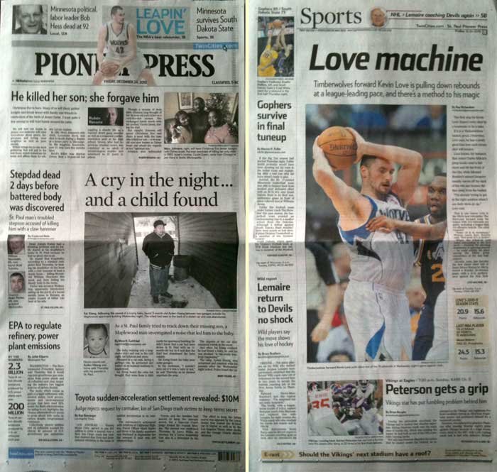
My copy of today's Pioneer Press front page (left) was printed with almost no ink on its yellow and magenta plates, which gave the photos a faded look, as if the page had been left out in the sun for a while. The photo of two women and a man at top right almost looks like a hand-tinted black and white print.

Pioneer Press 12-24-10 front page compared to the sports front page
For comparison, check out the basketball player at the top of the page -- it's the same guy shown on the cover of the sport section (right) in all his tawny glory. I love these minor errors in printing. They remind me that humans are involved.

Maryanna Manfred obit with headline Maryanna Manfred was editor in own right
I guess the Star Tribune obit writers didn't get the memo that it's sexist (and therefore, you know, offensive) to say a woman did something "in her own right." Yes, it's important to include that Maryanna's husband was Frederick Manfred, but do the words "in her own right" need to be in either the headline or lead? They're not only sexist; they're redundant.

David Brooks op-ed with box for his photo empty
A missing person on the Pioneer Press op-ed page a few days ago... David Brooks.... paging David Brooks.

Article headline Pants, dessert cones, 2011 Santa Fe models among recalls
The PiPress's consumer watchdog periodically notifies readers about recalled products. These brief stories often carry headlines combining a list of products that would make Marcel Duchamp a smile. (Okay, this isn't a mistake or an oversight... but it is amusing.)

Get in the Spirit of Consuming

It's hard to be shocked at the way consumerism is flogged as Christmas approaches, but here are a couple of particularly notable examples.

Macy's ad with Believe headline and six boxes of Frango mints
This Macy's ad combines the store's general holiday shopping theme "Believe" with a photo of Frango mints, which used to be a Christmas staple at Marshall Fields' stores before they were bought by Macy's. Frangos are a seasonal treat many look forward to, but they seem quite odd to me in juxtaposition with the quasi-religious word "Believe."

Of course, that theme seems a bit off altogether, when applied to a bunch of people shopping for stuff they don't need.

Pull quote reading If I need to sell my soul to save 5 percent, I'm going to do it
I cringed when I saw this pull-quote in the Star Tribune a few days ago. I have no criticism of the Strib for running it: It's both perfectly grammatical and reflective of what one shopper had to say as he waited in a pre-Christmas line to buy a T.V. with a screen bigger than some of the walls in my house. And I assume the editor who picked it for such prominent placement had a few thoughts about this guy's intellectual depth.

But what an extra-fine example of unconscious consumerism. Maybe that guy from Plymouth is ready for a treat to finish off his day of shopping...

McDonald's billboard with photo of beautiful whipped cream and caramel topped paper cup and headline Joy. Now in Liquid Form
I took this photo recently, and I've been saving it, trying to articulate why this billboard bothers me so much. Maybe it's something about a multinational corporation combining an unrealistic photo with one of our few remaining authentic words in order to sell sugar and caffeine. "Joy" is an inexpressible emotion, felt at the peak moments of life, and I can only shake my head that McDonald's has reduced it to this.

Better Photo Selection = More Information

Yesterday, a St. Paul baby was inadvertently abducted when his parents' car was stolen after he was left alone in it for a few moments. He was found, unharmed, about 90 minutes later.

The unbelievably stupid car thief ditched the car, but before that, s/he removed the boy and his car seat and left him by the trash cans outside an apartment building -- far from where anyone would find him quickly. The child was not wearing a coat or hat; it was about 20°F at the time.

Pioneer Press article with large photo of an Asian man standing between two garages by a trash can
The Pioneer Press coverage (with photo by Ginger Pinson showing the spot where the boy was left) gave a thorough recounting of how the child was found, including multiple quotes from Sai Xiong, the man who found him. The photo itself was key to getting a complete picture of just how out of the way the spot was -- and therefore just how stupid and callous the car thief was.

Xiong, pictured above, had gone out for a cigarette and heard a baby crying. He searched all around the area until finding the car seat, which had been left with the child facing away from any possible viewer, in a passageway between two garages that leads to a grilling area.

The Star Tribune's coverage, on the other hand, focused on the parents and child:

Star Tribune photo of a young Asian man hugging and kissing a baby by a Christmas tree
This heart-warming photo supports the narrative that the parents love their child and were not neglectful, but it gives no information about what happened to the child. And what could have easily happened to him if Xiong hadn't heard the baby crying in the hard-to-find location.

Score one for the PiPress. Plus an afterthought: This may be the first child to be saved by a cigarette.

Saturday, December 22, 2007

Lady Godiva...er...Korbel

Just driving down the highway today, minding my own business, when I saw this.


Aside from noticing that it's a throwback to the caveman era of advertising, I was also struck by how the woman looked like she was wearing no clothes.

Before you think I am hypersensitive, remember -- I was seeing this from a pretty long distance, where a red and white striped bikini blurs into a pink bikini, which in turn disappears against her basically pink skin. Try unfocusing your eyes when you look at it and see if you can simulate it.

Pretty distracting to be driving on an urban interstate highway and see a billboard with what appears to be a naked woman on it. Half naked or three-quarters we're used to, of course.

I wonder if the fender bender rate along that stretch has skyrocketed since the Lady Korbel billboard went up.