Showing posts with label Drive-by Shooting. Show all posts

Friday, November 21, 2025

Test Your Pee for Hidden Heart Risk

Highway 280 in Saint Paul is lined with billboards, some of which I've written about before. Currently, there's a billboard on the east side (northbound) that probably has the worst design of all time. 

There's an unwritten rule about billboards: they shouldn't have more than seven to 10 words at most. And I would add, their visual elements should be clearly understandable to the viewer. 

This photo is slightly blurry (my apologies) but even if it wasn't, that wouldn't help much:

I've been trying to figure out what this billboard image is for weeks when I drove past, or even what the words say. After a few tries, I figured out it had something to do with kidneys and getting tested for something, but until I took this photo and squinted at it, I had no idea that:

  • The red stuff in the middle is red smoke sent up from a flare, held by a hand at the bottom center of the billboard. We had speculated they were flower petals, or maybe blood.
  • The first line of centered type says (I think! I still can barely read it) "For those with high blood pressure or type 2 diabetes"
  • The slightly more readable reversed white bars say, "Are your kidneys sending an" and "for hidden heart risk?"
  • In between the two white bars are the partially obstructed letters SOS, with a cutesy heart in the letter O. Because there has to be a second heart to go with the larger smoke heart (you know, the one you couldn't tell was a heart in the first place).
  • Then there's "Talk to a doctor about the uACR* urine test" down in the dark reversed bar near the bottom. Now that's a memorable name for a test. Once I realized that wording referred to a test, I've tried to remember the test's name several times and never managed it. 
  • Finally, I only realized there was a little logo for "Detect the SOS" at bottom right and the name of a drug company, Boehringer Ingelheim, at top left when I looked at the photo. I never even noticed them while I was trying to decipher the many main parts of the message.
  • At bottom left is something I still can't read, just above the dark bar across the billboard. There's also some tiny type at bottom left, below the dark bar. Maybe that relates to the asterisk after the name of the uACR test. Lawyers must have insisted on those, since there's no way anyone could possibly read them. 

And isn't it so great how they wasted so much space on empty blue sky, while cramming all those words in too small a size into the center of the billboard?

For those wishing to count, there are 20 words in the four parts of the main headline, and nine words in the "talk to your doctor" call to action. I have no idea how many words are in the two other small lines.

Friday, October 10, 2025

Exception Proves the Rule

As seen on Franklin Avenue in Saint Paul, just east of the Minneapolis border:

This proves that not every owner of a black Ford F-150 with a vanity blackout plate is a jerk... I guess.

__

If you notice the weird semi-parallelogram and the 0 mph to the left of the license plate, that's the heads up display on my windshield, which indicates we were both stopped at a light when I took this photo.

Friday, August 22, 2025

Smiley Truck

Do you think the driver of this truck knows that — just in back of his head — his truck is smiling at the people driving behind him?

Or is it just my imagination?

__

Apologies for the blurry picture... it was taken through the windshield at somewhat a of a distance. 

Other posts about pareidolia (faces in things).

Tuesday, March 18, 2025

Look Closely

Look closely to see who has been trapped on this semi-trailer for a long time:

The truck and its abductee can use a wash, by the way.


Friday, April 7, 2023

Bad Billboards

Highway 280 in Saint Paul must be the ugliest highway in the Twin Cities, and that's saying something, since highways are generally ugly. Part of the reason it's so ugly is because it's over-ful with billboards, and of late, it seems as though those billboards have gotten more and more badly designed. 

Between University Avenue and Como Avenue, heading north, there are seven billboards, and not a single one of them is what I would call good. Only three of them are even readable, and of those one isn't really understandable. I'll group them from best to worst.

The best ones are not good:


The headline is readable, but the type along the bottom is not. Maybe that doesn't matter, as long as you know who Tom Barnard is. (I am not the audience for this billboard, however.)

Probably the best one, overall. It follows the rule of minimal words, gets the point across, and has a snazzy graphic, too.

This one has nice design, but the nice readable DEAN'S DOES type doesn't tell you what Dean's does. The designer left that for the low-contrast red type on a blue background: one of the worst color contrasts there is. A driver moving past at 55 mph or more cannot read that, let alone the tiny white type at the bottom. I still don't know what that part says.

The worst billboards are even worse, though:

I know this photo is bad, but the billboard is bad as well. Sure, you can read the phone number, and maybe that's enough. But the two guys in suits and the phone numbers is really all you get from it at 55 mph. And the color red.

Obscured behind a power line, I think this one may be a PSA. I have no idea what it's about. The headline is about reminding you to do some kind of checkup or change your smoke detectors or something... but that part — the real content! — is tiny, so I don't remember what it was. The too-long, not very clever part in the funky typeface at the top says "IF YOU SMOKED WHEN MONITORS WERE ALL MONOCHROME."

Here's another one that's a mystery to me. I have no idea what this billboard is for. A real estate service of some kind, maybe? Why would anyone bother to check into it from this billboard? And the tiny type below the headline might as well not be there.

Finally, even without my blurry photo, this is the worst one of all. Four lines of all-caps, tightly stacked extended type. And the words are not clever, so they're not worth struggling through. Then there's a logo at bottom right that I don't recognize or connect with anything. Some kind of crypto? Oh geez, get me out of here.

These businesses are paying at least a thousand dollars per month for these things, maybe a lot more given the highway location. I don't understand why they can't spend a little bit more money putting something onto them that actually makes it worth their expenditure.

__

I apologize for the bad photos; it's hard to take photos of billboards while going up a highway, even if you aren't the one driving. 

__

Here's an example of a local billboard done right from one of my past posts.


Wednesday, May 19, 2021

These Vehicles Should Be Illegal

There are quite a number of vehicles that should be illegal to drive on public streets. Today I saw a good example of one:

I saw this truck from two blocks away, it was so distracting. A lit billboard on all sides of a truck, driving down the street. It has no purpose except to distract other drivers (and I guess pedestrians and others who might see it going past).

The other vehicles that should be illegal would not necessarily be completely unsafe if they required a special drivers license with additional training. Unfortunately, they are much more common than this Christmas tree of a truck: They're full-size pickup trucks and many SUVs. They have high-profile front ends that make it impossible to see anything in front of the driver for many feet in front of the vehicle. 

They're also much heavier than sedans, and often more likely to roll over. For instance, the new electric Hummer weighs more than 9,000 pounds!

How long has it been since drivers licenses were assessed for their efficacy vis-a-vis the vehicles people are driving these days? What if a standard drivers license qualified you to drive only a vehicle under 4,000 pounds and under some front-end height? What if, to get a license to drive a heavier or taller vehicle, you had to have more drivers education to learn about some of the things commercial drivers learn, plus pedestrian safety, for instance?

I wonder what effect such a split in licensing would have on vehicle purchases and therefore vehicle production. 

And now we have the relatively new wrinkle of the extreme pickup of high-powered electric vehicles. Teslas already have this, of course, and now we're hearing about the F-150 Lightning truck going 0–60 in under 5 seconds. As if that's a good thing.

What we need instead are speed-governors on vehicles, at least in cities. There's no technological reason for these not to exist. Cars don't need to be able to go more than 60 or 65 at all (and anything over 80 mph is absurd), and on a city street they don't need to go more than 30. 

Another piece of the shifting worldview.

__

Late addition: I think I never linked to this Bloomberg article from a couple of months ago by Angie Schmitt, called What Happened to Pickup Trucks? As the lead-in says, "As U.S. drivers buy more full-size and heavy-duty pickups, these vehicles have transformed from no-frills workhorses into angry giants. And pedestrians are paying the price." And, as Schmitt says in summarizing a study, "women — who tend choose smaller vehicles — are suffering higher injury and death rates than their male counterparts, despite the fact than women engage in fewer risks and crash less."


Sunday, September 13, 2020

Local Quackery on Wheels

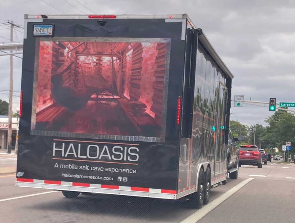
 I was waiting at a red light when I saw this trailer being towed in the adjacent lane:

Yes, it's meant for mobile pseudomedical treatment: halotherapy, where you sit in a dry room with pink lights and a lot of salt to improve your lung function and skin or some such.

We once lived in a functional country with a Food and Drug Administration that stopped things like this.

This particular "mobile salt cave experience" can be shared by six or seven people at once during public events, perfect for the pandemic near you.


Tuesday, June 23, 2020

Stop Using Hazel

There's a billboard that I've been seeing lately with some frequency. I kept meaning to get a photo of it to use as an illustration some time when I wanted to talk about how problems in our world are structural or systemic, rather than individual.

Well, I finally got a photo of it, so here it is:


It turns out I got the photo just in time to be paired with this stat from former New York Times labor reporter Steve Greenhouse, which he drew from Forbes:

Since the pandemic began, total U.S. billionaire wealth has risen twice as much as the government paid in stimulus checks to 150 million Americans.

Billionaires' wealth rose from $2.9 trillion to $3.5 trillion as $6.5 trillion in household wealth disappeared.
So sure, the promise inside Hazel is greater than the poverty around her in some metaphorical sense, but this headline is insulting.

ChildFund, I note, works in the U.S. as well as countries across the around the world. If our billionaires paid taxes instead of lobbying against them (when they're not offshoring and hiding their money), maybe children wouldn't have to rely on charities like ChildFund to be able to grow up healthy, educated, and safe enough to realize their promise.

Friday, December 6, 2019

Billbad

Sometimes a client has too much control over the concept used in their advertising. Case in point:


Only a dentist could think the idea of a headless person (er, tooth) playing hockey was appealing. And yes, this particular headless tooth person is playing hockey with a dental instrument. So the tooth is working on itself, or its neighbors, I guess?

It's a bit harder to see, but the logo at lower left is even worse than the main illustration. It's a heroic, headless tooth-as-Atlas, holding up a wire globe with the letters GD inside the globe. What the hell does it even begin to mean?

As seen at Cretin [yes, we have a street called Cretin] and Marshall Avenues in Saint Paul.
___

Apologies for the terrible photo... it was taken at night from a distance, resulting in this quasi-Impressionist drivel.

Saturday, October 19, 2019

Hyphen-Deprived

The first thing I think when I see this sign is, "That's a lot of words for a relatively small sign":


And then I think, "Would it have killed them to put a hyphen in each of those phrases?"

Maybe so. Maybe so.

Thursday, September 5, 2019

Baby's Got a Gun

My blurry photo from the streets of Saint Paul wasn't good enough, so I googled the words "lil hunter on board," and sure enough, it's a thing, as shown in the sticker I saw for sale on multiple sites:


Obviously, this is a strident version of the "baby on board" sticker. Remember, those stickers don't show a baby figure at all, they're just words, usually done in a way that emulates a yellow caution sign. This absurd sticker depicts a still-diapered baby holding a rifle with a scope.

Note: There have been at least 163 unintentional shootings by children as of today in 2019, according to Everytown USA, resulting in 59 deaths and 112 injuries. I don't really think a baby with a gun is a joke to make a sticker about.

__

Ironically, I've categorized this post under Drive-by Shooting.

Monday, July 8, 2019

A Saint Paul Summer Tableau

It hardly "bears" showing:


O Santa Bear, how the mighty are fallen, to the level of a backless bentwood rocker, free with a crib mattress and two July snowpeople.

Sunday, June 23, 2019

Art Cars Uber Back to the Fifties

This weekend it was Back to the Fifties time at the Minnesota State Fairgrounds, so thousands of vintage cars were being driven around the streets nearby, which is sometimes entertaining but more often disruptive.

My second worst experience was being caught in an impromptu traffic jam/parade at 7:55 a.m. on Friday when a dozen or more hot rods were waiting to cross a thoroughfare at an intersection where there isn't a traffic light. After a few minutes of absolute standing still (while on a deadline), I K-turned away from the exhaust in my face and took a different route.

The worst experience was today when I was following two World War II-era pickup trucks tricked out to belch coal-black smoke from fat pipes. On purpose. They made me want to have the whole event done away with immediately.

As an antidote, I present an art car I saw recently:


Breathe breathe breathe as long as you're not right next to a car or truck that's rolling coal.

Monday, May 13, 2019

One More Photo

And not only a photo, but another shadow photo:


It's spring... you can see it in the buds.

Friday, April 19, 2019

Invisible Dog

Anyone who has read this blog for a while knows I like to harp on badly designed billboards, especially ones you can't understand in less than a second, yet are placed along highways where you're going 60 miles an hour.

Here's my latest gripe:


This is along the west side of highway 280, facing you as you drive north, near the Energy Park Drive exit. I thought it was a woman looking into a grocery bag, perhaps, but that made no sense with the headline and call to action.

I wouldn't say it almost caused me to drive off the road because I'm not that obsessed, but it did take me more than one pass to figure out what was going on in the photo:


Yes, it's a blonde woman in a blond blouse and almost blond pants, holding the paws of a blond dog with its back to the camera and which is wearing a service vest that looks a bit like a grocery sack.

Why the designers of this billboard gave no thought to contrast between the colors in their model's hair and clothes or with the dog's fur, I have no idea. But I get a good laugh at the lump o' blondness every time I go past.

___

Here are a few of my past posts on billboard design:


Monday, December 24, 2018

Choose Happiness

This hand-made yard sign, painted on a mirror, is very hard to photograph but conceptually interesting.


Combined with the rainbow flag on the porch... these folks are not afraid to let people know what they think.

As seen in Como Park, Saint Paul.

Monday, November 12, 2018

A River Runs Through It, Badly

Here's an example that belongs in that logo hall of shame I never quite get around to building:


This is one of those concepts that sounds like it might work when you hear it described, but figuring out a way to turn an L into a river that reads easily with the other letters around it is no simple feat.

Personally, I keep seeing the name as "City ife." And when I make myself see the L (remember, I wouldn't have to work at it if the logo was successful), I find myself wondering why the river suddenly stops flowing at the edge.  Oh, and having the letters of "church" in the river doesn't help with the illusion of riverness, either.

To top it off, it looks more like a radio station logo than a church logo.

Friday, November 9, 2018

Not the Same Thing

There are so many important things to be angry about that affect so many people, but I still can muster some righteous anger about this advertising message:


In case you can't read the words in my bad photo (which was shot through the windshield while I was stopped at a light), it says, "You can't buy happiness…but you can buy Jackson Morgan Southern Cream, which is basically the same thing." And if it's not obvious from the graphics on the truck, Southern Cream is candified liquor with flavors like bread pudding, salted caramel, and whipped orange cream.

If this slogan isn't a good example of Johann Hari's description of lost connections and the way humans try to compensate for them, I don't know what is.

Thursday, October 4, 2018

Some Bad Signs

Wisconsin... land of bad signs? The first three shown here were all in one small area near Madison:


This was the first one I noticed: the extra-large initial letters, arranged vertically (almost always a bad idea); the relatively tiny letters that complete the words; the tiny church name. The circle outline inside a square box!


This flyer, posted inside window, uses every cheap trick in a 1990-era wanna-be designer's bag of tricks. The gradation (representing the sun?), the zigzaggy tree, the tacky Delphin font running over the varying color background with questionable readability.


The last Madison sign was not quite as bad as the other two, but it's not good. Why is ALL FAITHS off center? Why is the ampersand so big, when it's probably the least important thing on the sign? (And who broke the right end off?)

The final bad sign is on a truck, which wasn't a horrible design originally, but has been repainted over time by someone who is not a sign painter. In fact, it looks like it may have been painted by using the outlines created with an overhead projector:


Especially check out the letters in "Greenhouses Inc." Funky!

Wednesday, August 22, 2018

Bullbars: Safety for Me, Not Thee

This SUV has what's called a bullbar, grill guard, or push bumper on its front:


They were first common on police SUVs but it seems as though everywhere I look these days, civilian vehicles have them also. I know that's probably at least partly because I'm newly aware of them, but still.

Why do people think they need these?

The point is to protect your front bumper at the cost of everyone else's safety, especially pedestrians. Because of their height, SUVs are already more dangerous to pedestrians than cars, and these things make them even more deadly. As the Argus Leader story linked above says,

Barry Wellar, a retired University of Ottawa professor who often testifies as an expert witness in transportation safety cases, said little research has been done on the safety impact to pedestrians and cyclists regarding bull bars. What does exist suggests pedestrians' chances of surviving a collision are cut in half when bull bars are involved.

“They’re head high for a kid. They can take the bull bar right in the head,” he said. “And they’re absolutely killer for cyclists or pedestrians. It’s serious trouble.”
I can't help feeling that the people who buy these for their vehicles are afraid of the world and this is their chance to armor themselves and feel slightly safer. But that's not a good enough reason to endanger other people the way these things do.