When Coca-Cola created sugar-free Tab soda pop in the early 1960s, its first packaging was done by Chicago's Dickens Design Group and its logo was done by the company's owner, R. Sid Dickens, according to Randy Ludacer's Box Vox blog.

Because of the cyclamates cancer scare, Coca-Cola reformulated the drink with saccharin as the sweetener and ordered new packaging. I recently got a chance to talk to Knut Simonson, who worked at Dickens Design Group from 1969 to 1971 about the process of designing it.
Simonson said the goal of the new design was to more clearly emphasize the fact that the soda was sugar-free.
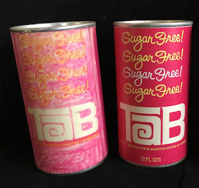
Sid Dickens' general practice was to have several designers do concepts for each project, and then Dickens would present to the client himself. Simonson remembers that his design was selected, but in looking at the photos of his loose and tight comps of the cans, you can see that the decision-makers combined elements of his designs to arrive at the final design:
Both a loose comp done with markers and a tight comp done in paint show something close to the final design. The differences are that the words "sugar free" are repeated four times instead of three, the lettering style is different than in the final, and the logo is smaller. (This loose script lettering had been used on some of the earlier Tab cans.)
Simonson's black design, shown here in a loose comp alongside a tight comp of a third design, is where the use of the Peignot typeface was introduced.
It's hard to tell without more research in the Coca-Cola archives whether this use of multiple lines of Peignot was done before or after the Mary Tyler Moore Show first aired. (Cyclamates were banned in October 1969 and MTM first aired in September 1970. Simonson remembers working on the Tab project about halfway through his time at Dickens, which would be early summer 1970.)
But at this point, probably only the archivists in Atlanta can say for sure.
The final production can shows the enlarged logo and only three repetitions of the "sugar free" line. I think that change from four to three was a good choice, since an odd number is visually better.
The now iconic pink can was the best choice of all, though.


1 comment:
Peignot — I have to remember that.
It’s difficult not to think that there’s an MTM connection, whichever the direction.
Post a Comment