
I noticed yesterday, when seeing coverage of the Saffron One's so-called press conference, that he's using a special logo during these pre-inauguration days:

If you zoom in, you can see that there's more going on in the design than just a red circle with a white bar across it :

That's supposed to be the White House (though it really doesn't seem to have any interior details in the drawing), and there's a blue ring with some tiny white letters surrounding, but it's undecipherable.
Here it is again from a newspaper photo, rather than from a television screen snapshot:

Still no details visible on that white, horizontal bar, other than the slight bump-up at the center.
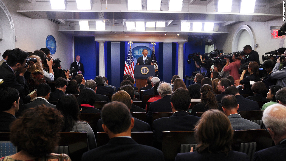
In case you were wondering, this graphic appears to be a whole-cloth creation of Donald's team; nothing turns up from Google images, and it's not related at all to the graphic used on or behind the presidential podium in the White House briefing room (shown here). For one thing, they don't use red. I wonder why? Hmm.
Am I the only one who sees Donald's logo, especially when shown at the kind of distance used to show the whole podium, as this:

...instead of what it's intended to be?
The Do Not Enter Presidency... they've got that right!
Thursday, January 12, 2017
My One Bit of Amusement
![]()
![]()
Subscribe to:
Post Comments (Atom)

2 comments:
Erik Spiekermann saw it too: https://twitter.com/espiekermann/status/819367142537605121
So you’re in good company — or he is. :)
Thanks, I didn't see that!
Post a Comment