
Since I'm a graphics curmudgeon, I tend to dislike the special logos Google puts up. (Here's an earlier post on one particular instance.)
It's a fun idea but all too often, the executions are conceptually and graphically weak. Yesterday, they put up this one:
I assume it's supposed to represent a pumpkin pie in the making, but when I saw it at this size on a search results page, I thought it was a squashed insect, lying on its back. Maybe at full size it wouldn't be so bad.
Google caught some flak recently for another one of its special logos, this one for Veterans' Day:
If anything, I would have thought people disliked it because the flag pole makes a very weak L shape and the flag makes the E unreadable. But no... the problem was that the bottom of the E looks like the Islamic crescent, and some folks thought Google was implying that the Islamic world would eclipse the West.
Interestingly, this wasn't the first time the designers asked the L to serve as a flag pole, with the flag covering up most of the E, leaving behind that threatening crescent.
Hmm. Clearly, this is an anti-Israel statement.
It's fun, though a bit overwhelming, to visit the archive of all the logos, which extends over 10 years. I learned from browsing it that Google puts up a lot more variations than I had realized, many of them specialized by country. I also found out that I don't dislike all of them. Here are a few nice ones.
This one was done for China National Day this year.
Marking the anniversary of the discovery of the Lascaux caves (seen in France).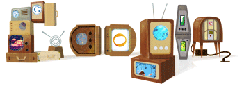
Honoring the Korean artist Nam Jun Paik, who makes sculptures from working televisions and other electronics.
Thursday, November 25, 2010
Google Logos: Squashed Bugs and Flag Conspiracies
![]()
![]()
Subscribe to:
Post Comments (Atom)

3 comments:
Today's logo is better than yesterday’s, at least in part because it includes roasted Brussels sprouts.
Happy Thanksgiving!
I thought the Google sprouts looked a little dark... I did mine caramelized in olive oil. They were good! And much brighter green.
Ha! I didn't see pie there either. But check out the Google logo for Dog Biscuit Appreciation Day - it is crystal clear.
http://alittlebrownblog.blogspot.com/2010/11/google-logo-gone-to-dogs.html
Post a Comment