
Some while ago, a friend sent me a link to this comic from xkcd:
xkcd is created by a geek named Randall Munroe, and it's very popular with the the boingboing cohort, among others... according to the Wikipedia, it gets 60 to 70 million views per month. (So I guess the odds are you already know about it.)
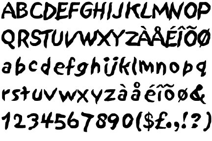
In case you don't already know what it looks like, here's a sample of Papyrus, much reviled among typefaces. There's even a blog called ihatepapyrus. Seriously.
The thing that bugs me the most about Papyrus is how light and wimpy it is. It has no graphic weight. I think its designer intended it to be used at large sizes, but it usually isn't.
It's one of those fonts that appeals to novices (like Comic Sans or Sand, or many, many others that shall remain namless). When you see Papyrus in a design, there's a 99.8% chance a designer was not involved.
A post from another blog, jesse.blisten.net, put it this way: "It’s that font that every small business thinks communicates exactly what their business is all about."
Tuesday, August 18, 2009
Love to Hate Papyrus
![]()
![]()
Subscribe to:
Post Comments (Atom)

1 comment:
Great quote about that blasted font, which especially proliferates among practitioners of the healing arts and on New Age menus. Would you trust a chiropractor (or massage therapist) who loves this font? Seriously. I'd rather be boing-boinged.
Post a Comment