
Very tired tonight because someone mistakenly served me caffeinated tea last evening at 7:00 p.m. and I couldn't get to sleep until after 2:00. So here is a bit of cat commentary from a guy named David on Tumblr:

Oh, how right you are, David.
Friday, September 30, 2011
Time for a Cat Comic
Thursday, September 29, 2011
SlutWalk, Part 2
Lagging the Pioneer Press by several days, the Star Tribune offered up this story on the upcoming local SlutWalk Minneapolis:

Contrast that with the PiPress's version from earlier this week:

It's funny -- the difference between the play of the two stories perfectly embodies why the SlutWalk organizers chose the name in the first place. As one person quoted in the Strib story put it, "If they called it a women's empowerment march, would the media have paid any attention?"
Ask yourself -- which of these two stories would most readers be likely to read? "Protest March Divides Feminists" -- it's a straight-up news head, yeah. I'm sure that's the one they'd pick.
And don't forget the PiPress ran it on the front page, while the Strib ran it on page one of the Variety section (which some still remember as the "Women's Pages").
So once again, bravo to the PiPress designer and the editor who okayed this layout and placement. On the heels (no pun intended) of the news that FBI stats omit about 20 percent of rapes because their definition of the crime was written by Andy Rooney's grandpa, anything that calls attention to the realities of rape gets my vote.
Wednesday, September 28, 2011
Ryan Dow, Happy But Still Introspective
Ryan Dow's Introspective Comics is always worth reading, but today's was particularly resonant for me.

Thanks, Ryan.
Tuesday, September 27, 2011
A Tab Roundup
Here are a few things I've been reading lately in the press.
An excellent two-part series from the Pioneer Press on changes in Worthington, Minnesota, because of immigration and population shifts over the last 10 years. A city of about 13,000, Worthington has gone from being almost a hundred percent white to having a population that's 35 percent Latino, with a fair number of African immigrants as well. One effect is that the downtown is bustling, unlike those in many of Minnesota's other small cities. The city also has low crime and low unemployment. The schools are coping creatively with the influx of English language learners, it sounds like. But I can't get over this chart from part 2, which focused on schools:

This New York Times review of a book with a provocative title: "Is Marriage for White People?" The book is by a Stanford law professor, and the review by an African American studies professor at Princeton. The reviewer writes, the book "doesn’t offer a jeremiad about the decline of black family values in the way of so many others who do little more than regurgitate Daniel Patrick Moynihan’s 1965 report, 'The Negro Family: The Case for National Action,' which described black family structure as 'a tangle of pathology.' Refreshingly, Banks offers a well-researched and probing discussion of why marriage rates are so low among black Americans."
Debunking the Cul-de-Sac from The Atlantic. It's easy to think that people who live on cul-de-sacs are safer from traffic, but it's not true. A study in California found that the safest cities had one thing in common: They were built before 1930:
These cities were built the old way: along those monotonous grids. In general, they didn’t have fewer accidents overall, but they had far fewer deadly ones. Marshall and Garrick figured that cars (and cars with bikes) must be colliding at lower speeds on these types of street networks. At first glance such tightly interconnected communities might appear more dangerous, with cars traveling from all directions and constantly intersecting with each other. But what if such patterns actually force people to drive slower and pay more attention?The gist of it is, cul-de-sac residents are safer on their own street, but the dangers of the arterial streets that surround them more than offset that safety.
An NPR story on the possible effects of changing over to truly "smart" cars that don't require driver input. Did you know that 1.5 million Americans have died from car accidents just since 1975; compare this with 1.3 million killed in every war since 1775.
Miami Herald columnist Andres Oppenheimer offered this nice breath of air, reminding us all that while things may seem like they're going downhill, if you take even a short long term view, we are generally much better off today than they were, say, 25 years ago. Worldwide numbers on life expectancy, infant mortality, percent of people with access to water, percent of people in extreme poverty, secondary school enrollment, and the number of armed conflicts have all been moving in a good direction. (Well, I would call it good, since I'm not a misanthrope.) Oppenheimer's thoughts make a nice companion piece to the Louis CK bit I wrote about earlier.
Am I the only one who exclaimed aloud (if that's not redundant) over yesterday's Pioneer Press front page?

This type of design-integrated-into-the-story layout is common in the features sections of newspapers, but you don't usually see it on the front page. The story, in case you were wondering, is about the first "slut walk" in the Twin Cities. The walks are a recent reaction by young feminists to the belief that women who dress "suggestively" are asking to be sexually assaulted. The women who organize slut walks say they are reclaiming an offensive word to call attention to its assumptions, as GLBT activists have done with the word "queer." The story, by Richard Chin, does a good job of representing the different opinions on that idea. But I was most interested in the layout, and how it came to be used on the front page. And whether there will be any reader backlash to the headline, especially in the context of the layout.
Monday, September 26, 2011
Baby Marx -- Fun with the Dismal Science
August was a busy month, so I didn't make it over to the Walker Art Center when the Baby Marx show first opened. Big mistake. It was the most fun I've ever had at the Walker.

Created by Pedro Reyes, it's not an exhibit in the usual sense, not even within the off-kilter world of modern art. It's a bunch of excellent puppets and an exquisite set used to make a sitcom about economics.

Karl Marx and Adam Smith are the stars of the show.

Supporting characters include Frederick Taylor and Vladimir Lenin, plus Stalin, Mao, Che Geuvara, and Milton Friedman, among others.

The set is a modernist public library, designed by Reyes, whose background is in architecture. (It's not quite visible here, but there's a miniature surveillance camera to the left of and above the front door.) For scale, imagine that the black framework below is about 4 feet tall; the building is about 20' wide.

Inside, the library is two stories tall, with a pillared balcony encircling the Information desk. Books in Library of Congress order fill the stacks to either side on each floor.
Excerpts from a couple of the shows shot at the Walker are available on small TV monitors around the room -- but I wished for more!

In this scene, from an episode called "Alienation," Marx and Smith argue over a cookie in one of the Walker cafés. Marx has a cookie, while Smith does not. Smith says that if Marx believes in his own words, he'll share the cookie with Smith. Marx replies that if Smith is true to his words, he would have bought his own cookie. And so on.
Just found "Alienation" on YouTube, whoohoo! Here it is. Note that Marx's voice is a dead ringer for Strong Bad, which made the whole thing much funnier:
Baby Marx reminds me of my shallow knowledge of economics. Time to dig out Adam and Karl and do some reading, perhaps.
Sunday, September 25, 2011
I Just Don't See "Throng" Often Enough
Last week, after the Missoni gold rush that crashed Target's website and left a lot of shoppers hunting for trendy zigzag wearables, the Pioneer Press ran this story:

I, however, managed to read the last word in the headline as "thongs," which made for a much more enjoyable, if somewhat confusing, reading experience.
Saturday, September 24, 2011
More About Exclamation Points!!!
Commenter Peter sent a link to this excellent bit about the disease of exclamation points in museum communications after reading yesterday's Maggie KB story about science museums. I guess he's been reading my thoughts on those pesky bits of punctuation. Thanks, Peter!
The writer, Nina Simon, is executive director of the Museum of Art and History in Santa Cruz, Calif. Among many other insights, she writes:
Excitement is good, but it's hard to direct it to a broad audience of visitors and passersby. Passion is best communicated personally, so that the receiver can soak in the directed energy of the giver. Exclamations fall flat when they are shared in the impersonal, one-to-many format of most museum communication. If a staff member talks a visitor through the museum map and then scrawls, "you will love this exhibit!" over a particular area, that statement feels genuine. It's infused with the specific energy of the relationship between those two people, no matter how brief. But that same statement printed on the map for all to see feels like a fraud. It turns a personal sentiment into a banal, desperate sales pitch.Simon gives an example of a sign that says "Enjoy the Sculpture Garden!" I admit that I would find such a sign a bit flat-footed without the exclamation point, but that got me to thinking. What is the reason to have such a sign in the first place? Do I as a visitor to the garden need to be encouraged to enjoy it? No. So take out the sign, not just the exclamation point.
Friday, September 23, 2011
Science Museums, Not for Kids Only
Maggie KB over at Boing Boing always manages to worry about things I've never thought about much.
We graduate high school knowing that Issac Newton discovered gravity, the general anatomical location of our stomachs relative to our hearts, and what happens when a car travelling 30 miles per hour crashes into a brick wall. At some point, probably in grade school, somebody told us about the scientific method, but not how that actually plays out in the real world. We learn the basics. We memorize some charts.Aside from improving science education in the schools, what is to be done for adults? We can look to two institutions, she says -- science journalism and science museums. Museums are the more trusted, but Maggie spends the bulk of her post writing about how museums fail adults. Worth a read!
And then we live our lives in a world where science is much more complicated, and constantly changing.
Of the emerging technologies that New Scientist believes will be vitally important during the next 30 years, not one is something I learned anything about in school. Synthetic biology, remote sensing, machine language translation, artificial intelligence, and, yes, nanobots.
Catching Up with Omar (I Mean Michael)

For my fellow Wire-heads: An interview with Michael Kenneth Williams (Omar Little in The Wire!). What he's been up to, where he came from, and how he worked out Omar's character.
Indeed.
(Photo by
Thursday, September 22, 2011
Not for Sale?
Another one for the "Blog" of "Unnecessary" Quotation Marks:

Seen on Lexington Avenue in St. Paul.
Wednesday, September 21, 2011
Up in Arms, Once Again
As I said in an earlier post, "there's got to be a limit on what nouns you can put in front of the word arms before passersby laugh in your face."

Seen in West Salem, Wisconsin.
Tuesday, September 20, 2011
John Birch, Sugar Daddy
 I just found out that Robert Welch, founder of the John Birch Society, was also the inventor of the Sugar Daddy caramel lollipop. And Junior Mints, too, damn! I love those. Welch got rich by coming up with new ways to sell sugar to children, which, ironically, has probably done more to undermine America than any Communist infiltration.
Another original Society member, Fred Koch, was the founder of Koch Industries. His sons, David and Charles, continue his work through their funding of the Tea Party, Heritage Foundation, ALEC, and a wide range of other right-wing causes.
Also news to me: The JBS, as it is affectionately called, is headquartered in or near Appleton, Wisconsin. Along with Colorado Springs, Colorado (home to Focus on the Family), it's one of those towns that isn't helped by its association with the political group it houses.
Isn't it odd that when the JBS was first in business, at the height of the Cold War, it was roundly criticized and clearly left outside polite political culture, but now much of its bonkers worldview has become mainstream Republican talking points?
I guess having a bunch of financial sugar daddies made all the difference in keeping the Bircher creed alive and well.
Monday, September 19, 2011
An Apology
I got a new Scrabble game recently. It's meant for travel, so the tiles are held in place and you can fold the board up without scrambling the arrangement.

This set of plays, early in the board's inaugural game, struck me funny. It might even suggest a plot idea for yet another zombie novel, since they seem to be running out.
Sunday, September 18, 2011
Support for the HPV Vaccine from an Unusual Source
Michael Gerson, former speechwriter for George W. Bush, writes a syndicated column offering perspectives I don't usually agree with. Today, though, he took on Michele Bachmann and the anti-vaccine crowd, and I was very impressed with both his logic and his writing.
It started with this, which the Star Tribune excerpted as the article lead-in: "Bachmann herself seems prone to a serious condition: the compulsive
desire to confirm every evangelical stereotype of censorious ignorance."
In refuting the belief that the HPV vaccine somehow will cause teens to become promiscuous, Gerson writes:
...it is unlikely that a 16-year-old making sexual choices is focused on her chances of getting a cancer that might develop 20 years in the future -- a hypothetical event beyond the time horizon of the adolescent mind.He also gave an example that is exactly the same as one I have been making when discussing the vaccine:
The more disturbing moral failure concerns any parent who would entertain this argument.
Try to imagine a parent-daughter conversation about sexual restraint and maturity that includes the words: "Honey, I'm going to deny you a vaccine that prevents a horrible, bleeding cancer, just as a little reminder of the religious values I've been trying to teach you."
Consider a woman who is resolutely abstinent until her marriage at 24. Her husband -- who got HPV from a girlfriend who was not vaccinated -- unknowingly gives it to his wife on their wedding night, increasing her risk for cervical cancer. She would suffer because others are not vaccinated.Wow, Mr. Gerson, if you keep writing like that, they may take away your Heritage Foundation credentials!
The decision to vaccinate -- for HPV or any infectious disease -- is not just a personal, family choice. It is also a matter of public health. And it is not unreasonable for public authorities to strongly encourage responsible parental choices.
I wonder if Gerson has some personal experience with HPV and cervical cancer in his family -- which I suspect may also be the case with Rick Perry. That's just speculation, of course, but it seems as though when super-conservatives do something I consider reasonable (like Dick Cheney being so moderate on the gay marriage issue because his daughter is a lesbian), it's because they have a personal story that makes the issue real to them, and not just a political football.
Saturday, September 17, 2011
Uncut Dollar Bills Cost Over 7 Times Their Value
There's not much new to say about today's World Reserve Monetary Exchange ad for uncut sheets of dollar bills. I said it all last year about a nearly identical ad from WRME that sold $2 bills.

The layout is identical; the copy is the same except for the change in denomination. All the same puffery, misdirection away from the listed price, and false sense of urgency meant to make you buy now instead of think for just a minute.
It took a thorough reading for me to realize the price was $29 PER SHEET of dollar bills (with four bills per sheet). So that's 7.25 times the face value, folks. Even worse than the deal they offered on the uncut $2 bills.
The ad has the gall to claim the bills are being sold at "just face value." Face value is $4, the amount the bills would circulate for. The extra $25 must be to pay for the "protective bankers portfolio." Plus shipping, don't forget!
Friday, September 16, 2011
Tabs for a Fallish Friday
My clipping pile and open tabs are building up, so here are a few short ruminations.
Driving the Drink
In its Sept. 4 report on a bottled water ban at local colleges Macalester and St. Benedict's, Star Tribune reporter Jenna Ross wrote:
The bottled water industry argues that bottled water beats other packaged beverages -- both for the environment and for people's health. Bottled water has "the lightest environmental footprint of all packaged beverages," according to the International Bottled Water Association, and, unlike soda and juice, is sugar- and calorie-free.While clearly this is true, all it does is point out the bad environmental footprint of packaged beverages in general. The vast majority of liquid in any packaged beverage is "just" water, most of it drawn from municipal water supplies in whatever town plays host to the bottling plant. In India, for instance, Coca Cola has been assailed for drying up community water sources. Does it make sense to take water from a drought-stricken region to make soda pop?
Does it really make sense to ship what is essentially water at all? I seem to recall Michael Pollan pointing out in The Omnivore's Dilemma that the foods that make the most sense to ship long distance are the lightest ones, which are the ones with the least water in them. Drinks of any kind would have to be at the wrong end of that continuum, let alone ones that have no or negative nutrition in them.
And speaking of sugary beverages that are mostly water, I had to laugh at a story from today's Strib. Apple Juice Dangerous? FDA Says No, the headline read. Wow, I thought, someone must have tried to point out that apple juice is basically sugar water, which is clearly a part of the cause of the obesity epidemic in children. But no -- the danger in question is arsenic in the juice, which TV-doctor Oz recently talked about on his show. So Dr. Oz will take a beating for saying something that appears to be exaggerated, but no one will say that training kids to drink sweet drinks sets them up for a lifetime of weight problems.
Lost Crops of Africa
From the Strib, September 6, a good news story: Nonprofit-beat reporter Jean Hopfensperger tells about Compatible Techology International, a St. Paul-based NGO that for 30 years has worked to improve traditional African crops and develop more efficient, low-energy ways of harvesting them.
The story focuses on the test fields at the University of Minnesota's agricultural campus, where they grow millet, teff and peanuts. Hopfensperger writes, "One reason [for the crops' neglect] is the crops don't get high yields, said Clarke, and they're time-consuming to harvest. Another reason is that corn, wheat and other crops were introduced years ago and offered more opportunities to export. Unfortunately, they can't survive drought, a frequent occurrence in Africa, said Salway. Traditional crops can."
The plants are only part of work, though. How do you turn what is essentially grass into food? CTI's hand-cranked millet milling machine, for instance, "stripped away hundreds of tiny grains in about 40 seconds. It's a huge improvement on the methods used by poor African farmers: They beat the millet on the ground or use a mortar and pestle, said Salway. Farmers lose up to 50 percent of their crop doing this, he said."
CTI's Ewing grinder converts grains into flour in seconds; in 10 minutes it does what takes an hour with a mortar and pestle. Its fuel sticks, made from rice hulls, are in production in Bangladesh, creating an alternative to burning wood.
When Rights Are Wrong
Today's Strib included a review of a new documentary called The Wrecking Crew. It tells about the group of L.A. session musicians who played backup on recordings by groups like the Beach Boys, the Righteous Brothers and Sonny and Cher. But get this:
Denny Tedesco worked on this film for more than 12 years. He still hasn't found a distributor, because he needs to raise more than $300,000 to cover fees for the use of more than 130 songs from the 1960s.Three hundred thousand dollars to pay for what is clearly fair use in a documentary meant as a love note to the music and muscians. Meanwhile, Europe has extended the copyrights on music from 50 to 70 years. God forbid the music of the British Invasion should ever become part of the public domain!
More on Peak Oil
I was happy to find this bit of writing, more nuanced than Jame Kunstler can manage, on what's ahead for us when it comes to energy. It's by Goddard professor Charles Eisenstein.
By the way, I just started reading Ready Player One, a science fiction novel that takes place in 2045 in the ruins of post-oil America. It's a completely different scenario than Kunstler came up with in his World Made by Hand books... kind of a cross between Cory Doctorow's For the Win and Octavia Butler's Parable of the Sower.
Not Obscene, It Just Looks that Way
If you need a laugh after all that, check out these photos (one, two and three) that appear to be not safe for work but are actually completely innocent. It's amazing what a little imagination can do with some two-dimensional color blobs to create what the blogger calls a "rude illusion parade."

Thursday, September 15, 2011
Tune in for Mnemonics

At some points in my life, I've been able to list all of the presidents of the United States in order. (I still can for the most part, but I tend to get a bit lost in the 1830s-1850s and 1870s-1880s.)
I just found out about a new tool to help me out with that: Jonathan Coulton's song The Presidents. Here's a sample:
Andrew Johnson just survived impeachment.Hayes, yeah, that's the one I always forget. And that earlier spate from Harrison through Pierce, I can't make that stick in my head. Maybe Coulton's song will help me.
General Grant enjoyed a drink or two.
Rutherford B. Hayes ended reconstruction.
Garfield was assassinated in 1882.
Don't get me started singing the song with the states in alphabetical order. Hey, did you know that was written by Ray Charles?
Wednesday, September 14, 2011
Reality Check, Please
Am I losing my eyesight (or possibly my mind)?
Every time I glimpse this sticker:
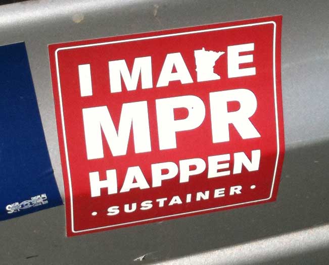
... or its other incarnations, such as t-shirts at the Minnesota State Fair, I instead see this:

I know it appears I am willfully ignoring parts of the design, but I'm talking about at first glance, before I take in the "HAPPEN" and "SUSTAINER" lines.
Tuesday, September 13, 2011
Pacifist Rebuttal
A response from the Boing Boing to Flickr pool to the driver of the red Chevy Cavalier from the other day:

Monday, September 12, 2011
When Icons Are Dumber than Words
Three guesses. What does this symbol mean?

I had absolutely no idea, even though I had the hint that it was in a hospital room.
What good is a symbol if it's more unclear than words would be? I know there are many people in hospitals who can't read or can't read English, but would they be any better at deciphering this symbol, especially if they come from a non-U.S. culture?
In case you're as dense as me, here's another hint: Think original Francie doll with a giant, old-fashioned nurse's hat.

That's right: It's the nurse call button that's part of a hospital bed. Because all the nurses these days dress and do their hair like Francie.
Sunday, September 11, 2011
Fifteen and 1956
 I wrote earlier of my surprise that Beverly Cleary's Jean and Johnny (published in 1959) wasn't a typical girl-gets-the-boy teen romance. Now I know it's probably because her earlier novel Fifteen, published in 1956, had already covered that ground.
The protagonist, Jane Purdy, finds and fascinates a boy named Stan. It's all very sweet without being sickly, moved along by Cleary's gentle observations of teen angst.
Like Jean and Johnny, though, Fifteen is a nice record of social history. From the cars to the clothes to the detailed descriptions of decor in the homes of Jane's babysitting clients, it's an informative look at the world of the mid-1950s in Marin County, California. Here are a few specifics gems.
Clothes, Hair, and Homes
On the night of her first date with Stan, Jane "decided that her hair simply would not do, so she washed it and put it up in pin curls, each one clamped with two bobby pins. 'Why, Jane, I thought you washed your hair day before yesterday,' remarked Mrs. Purdy. 'Did I? I don't remember,' fibbed Jane" (page 55). So the idea of washing your hair every other day was radical enough to remark on.
While anticipating the first date, Jane casts a critical eye on her mother's way of dressing: she wishes "her mother would put on some stockings and wear a dress instead of that striped cotton skirt and red blouse. It was so undignified for a mother who was practically forty and very old-fashioned to go around with bare legs, even if they were tanned, and to wear such gay clothes" (page 60). Leaving aside the now-anachronistic use of the word "gay," I found the description of Jane's mom's wardrobe challenges humorous. These days, a girl would be more likely to wish her mother would stop wearing stockings and go bare-legged, as is the current fashion.
One of Jane's babysitting client families has a toddler daughter still in diapers. Cleary provides a detailed description of what child-proofing a house was like in the 1950s: rope tied around the refrigerator door, yardsticks stuck through drawer handles to keep them closed, and all the knobs removed from the gas stove (page 192). It made me both appreciate and rue the vast selection of plastic gadgetry on sale to American parents these days. Maybe a little more DIY on that front would be good for us.
Race (Just a Bit) and Gender
On a double date, the boy from the other couple whistles when he sees Jane and says "Hey, don't you look nice!" This is followed by the omniscient narrator telling the reader, "It always helped a girl to have a boy whistle at her" (page 110). I almost choked when I read that. While I suppose it's a bit different when a guy you know whistles at you in a context like this, the blanket positive statement about wolf whistles doesn't reflect my assessment of how women feel about being whistled at over the last 35 or so years.
When Jane, Stan and some other couples go into San Francisco's Chinatown for dinner, one of the other boys suggests they have "flied lice" to eat. Jane has never been near a Chinese restaurant (another oddity, now that I think of it) and is alarmed that she might have to sample lice. Stan, who used to live in the city and is the one who suggested going to Chinatown, says: " 'Don't pay any attention to him.... He thinks he's saying fried rice with a Chinese accent, but I have lots of Chinese friends in the city and I never heard anyone talk that way" (page 114). Stan's reproofing of the ignorant friend is an interesting bit of cultural pluralism in the midst of a story from the peak of what some would consider the golden age of white America.
A key part of the book's plot is Jane's agony of never knowing if Stan is truly interested in her. Will he call her or won't he? Some of it is just the back-and-forth of getting to know someone as a potential romantic partner, but when the first school dance rolls around, the gendered rules of engagement become clear. Despite showing every interest in her, Stan doesn't ask Jane to the dance. A few days before the date arrives, she finally gets up the courage ask him if he's going to ask her, and he makes it clear that he wasn't going to (although the reason is withheld for the time being to build the plot). Jane thinks to herself, "Of course Stan had a right to ask anyone he pleased to the dance. But she had thought...she had wanted...she had been so sure" (page 134). Jane has no right to ask anyone she pleases, of course, and that is completely unquestioned. In fact, the omniscient narrator goes on to say: "Stan was so nice to be with and she had been so sure...But she had no right to be sure. She knew that now" (page 148).
The book ends when Stan gives Jane his silver ID bracelet, signaling that they're going steady. Now all of Jane's worries are over. Her role in life is clear because she has been marked as "Stan Crandall's girl."
Grammar and Usage
I read recently (although I can't remember where, or how authoritative a source it was) that the subjunctive in English is to be used when the conditional state is unlikely or unrealistic, such as "If I were you." I can never be you, hence the subjunctive. If the conditional state is realistic, you would instead say "If I was going to the store, I would remember to pick up milk." But on page 86, Cleary writes: "Jane flew to her room, combed her hair, decided to change from her yellow dress into a dress Stan had never seen, decided against changing, because she might not have time, and wished her mother were wearing stockings." Those darn stockings again, but more to the point, she "wished her mother were wearing" them. Over-correction, or did my source get it wrong?
Jane, who is a sophomore, sits through an English class focused on what Cleary calls "squinting modifiers" (pages 149 -150). I don't remember ever hearing that phrase, but here's the example that's given: "Some members of the class I know are not paying attention." So now I have a new term to add to my grammar curmudgeon vocabulary.
Cover Art
In writing up these thoughts on Fifteen, I found a blog called Secrets and Sharing Soda, which had a nice write up on the book, and also included the cover art from many if not all of its editions over the years. So I thought I would end with those. Each one is its own little time capsule, just as the original cover is:
From a 1970 "problem novel" to a 1990ish romance...


to a 2000ish "fun" book...

...and from a 1980ish "After School Special" drama to someone's attempt to recreate a period look (not sure when this last one is from; possibly it's recent).


Saturday, September 10, 2011
Badly Served by "Deserve"
A letter to the editor from today's Star Tribune cited the following stats:
In Ike's day, the bottom 90 percent (of income-earners) held 60 percent of the wealth. Today, the top 1 percent to 2 percent have 40 percent; the next 8 percent have 33 percent, and the bottom 90 percent have 27 percent.When people like me or Greg Van Hee, the writer of the letter, give numbers like that, we assume it's self-evident that a change in wealth distribution like this is a problem, and that the 1950s distribution of wealth was closer to the ideal.
People of the Right never seem to hear these stats, or at least appear to be unbothered by them. I think I just figured out why: They believe that the bottom 90 percent in the 1950s worked much harder than the bottom 90 of today, and so that earlier generation deserved their wealth while today's bottom 90 are slackers.
As a correlate, they also think the top 1 or 10 percent today have worked harder and smarter than either the bottom 90 or the top 10 of the 1950s, and so deserve that much more wealth.
Which reminds me of a quote from Ursula LeGuin's novel The Dispossessed: An Ambiguous Utopia:
"For we each of us deserve everything, every luxury that was ever piled in the tombs of the dead Kings, and we each of us deserve nothing, not a mouthful of bread in hunger. Have we not eaten while another starved? Will you punish us for that? Will you reward us for the virtue of starving while others ate? No man earns punishment, no man earns reward. Free your mind of deserving, of the idea of earning, and you will begin to be able to think."
Friday, September 9, 2011
But What Do You Really Think?
You never know what you'll see on the backs of people's cars.

I know these sticker shockers are hard to read in the photo, so here's what I've deciphered.
First, the one that got my attention with the all-caps word PACIFIST:
The PACIFIST is a traitor to his country and to humanity as is the most brutal wrongdoer. (Accompanied by a picture of Teddy Roosevelt, so I assume it's a quote of his.)Then I noticed the others:
The First Amendment grants Freedom of Speech. The Second guarantees it!The one that I thought topped it all was:
United States Army
God bless America(n)
Minutemen:But then there were the ones I couldn't read until I analyzed the photo:
Doing the work that George Bush won't do
WAR IS NOT THE ANSWER?
"The person who has nothing for which he is willing to fight, nothing which is more important than his own personal safety, is a miserable creature, and has no chance of being free unless made or kept so by the exertions of better men than himself."
- John Stuart Mill
What appears to be peace symbol is actually a black silhouette of a B52 over an American flag, with the words PEACE THE OLD FASHIONED WAY.

And finally, drum roll....

A Darwin fish, tucked just to the left of the license plate.
But then again, maybe it does fit with the other stickers, since the owner of the car is probably a social Darwinist.
_______
Past bumper sticker posts:
Sticking It to Them
Misuse of a Semicolon
Say It Loud, I'm Whack and Proud
Watch Out for Those Bumpers
Thursday, September 8, 2011
A Name I Hope Is Bad for Business

As seen in Lindstrom, Minnesota.
Other names that are bad for business:
June 29, 2008
July 23, 2008
August 12, 2008
December 30, 2010
Wednesday, September 7, 2011
Good Humor Truck
If you have to drive a big truck around town to deliver your product, you might as well make it pleasant to look at and, hey, even humorous.


Note the part about the pot holes.

Good going, Summit Brewing.
Tuesday, September 6, 2011
Reduce, Reuse, Re-Cycle
Harkening back to posts on kitty litter buckets and do-it-yourself bike modifications, today's post is a recent photo find from the streets of Saint Paul:

A nice way to reuse a bit of the plastic detritus of the modern world.
Monday, September 5, 2011
The Original Slinky
Looking through the enormous file of photos my family has accumulated, I ran across this one of a Slinky box, taken in an antique store.

I love those how-to diagrams. And it's striking that there's no ® symbol next to the brand name. Simpler times, simpler times.
Not to mention: CenturyLink will be interested to know that the packaging is printed in green.
Sunday, September 4, 2011
Ads These Days
There has been a spate of interesting ads of late. And I use "interesting" in the Minnesota sense of the word, which is synonymous with "something I don't really like but am too polite to say so."

First is this hard-hatted guy pitching for the pipeline from the Candian oil sands in Alberta. That's the pipeline that would cross from Montana to South Dakota and then on through Nebraska, Kansas, Oklahoma and Texas, i.e., the entire height of the lower 48 states. The one that people have been getting arrested about all week in Washington.
Yes, we need jobs, but building a pipeline to funnel the dirtiest of oils across huge swaths of land so that we can pretend peak oil isn't happening for a few more years isn't the way to go about it. Maybe hard hat man would be just as happy putting up wind turbines or building high-speed rail. How about that?

This hard-hatted guy is thanking Erik Paulsen, Congress member from the Twin Cities' western suburbs, for supporting a bill that takes the long-term cost of construction projects into account, so that things are built to last. That sounds reasonable, but something about this smarmy ad makes me suspicious.
The WhatAreTheRealCosts.org link goes to a site that (after a little looking around) says it is funded by the Portland Cement Association, so I guess this is part of the cement vs. asphalt quarrel that's been going on for a long time. I know next to nothing about the arguments on either side in that fight, but I would think the environmental impact of each should also be part of choosing an approach, since that's also part of its long-term cost.
While asphalt is necessarily oil-based, it sounds like there are environmental arguments to make in its favor. Concrete, on the other hand, creates a light-colored surface, which would be advantageous for preventing the heat-island effect. No answers from me on this, but just a sneaking suspicion that it's more complicated than this ad lets on.

I found this drug test ad disturbing. At first I thought it was targeted to people who want to check their own drug status before they get tested at work, but then I read the subhead and copy and realized it's meant for parents who want to test their kids.
That's needed sometimes, I'm sure, but the fact that there's an ad for it in the newspaper implies that it's a broad problem, and that people who read the paper are looking for this type of solution. I'm not sure why that rankles me, but it does.

And finally, there was another illogical Slinky ad from CenturyLink, our new phone and internet service provider.
It's somewhat less bad than their earlier ad, but I still don't get how a Slinky is supposed to symbolize connection, let alone a straightforward connection. After all, it's a twisted, flattened wire that uses dozens of times more material to cover a distance than regular wire.
Saturday, September 3, 2011
Damn You, Homonym!
From the Boing Boing comment thread discussing last week's JC Penney shirt P.R. disaster:

(As always, click to see it larger.)
Not to mention the concept of "over censorship." As if censorship is okay, as long as it's not "over" censorship.
Friday, September 2, 2011
State Fair, the Road Unbeaten
It's that time of year in Minnesota once again -- the State Fair. As amused as I was by Joe Loveland's screed about all the things wrong with local TV news coverage during the Fair, which touched on the many reasons to find the Fair annoying in general, I couldn't stay away.
It was a short trip, about four hours, focused on a few foods, the crop art and the art show. No live animals were seen in the making of this visit, I'm afraid.

Unless you count the Fair's mascot, which is a gopher in a green and white jacket and a straw hat.

The gopher has his own security detail. I'm afraid to think about why he needs such a thing.

Some parts of the Fair seem to meant to make you feel like you've fallen into the Bible Belt...

...even though you're in the middle of what's supposed to be a "blue" state.

These children were busy obeying the gender color coding at the mini-ATV booth.
Okay, enough crabbiness. How about some positive things from the Fair?

I appreciate the work of the Minnesota Pollution Control Agency up at the Eco Experience building. They create excellent graphics that get the message across to the public.

I loved this guy's shirt.
The art show was much better this year, as noted by the Star Tribune's Mary Abbe. In addition to the absence of any cow art, I think it's because the show's organizers finally gave up the annoying habit of grouping the pieces by their most obvious commonalities. (Four works that have crows? Let's put them all on the same wall!) Instead, they managed to create harmonious groupings that didn't detract from the works.
A couple of favorites from the art show:

This acrylic by Krista Kelley Walsh was painted on lottery tickets.

I forgot to note the name of the artist who created this sculpture, but it's worth clicking to see the larger version of it.

The Creative Arts Building gave over an entire glass showcase to Kuhlman's Tinker Toy Carnival. Super fun to look at.
The crop art was excellent, as always.

My favorite was Laura Melnick's riff on Ezra Jack Keats's The Snowy Day. Tim and Michele welcome atheists, tree-huggers, GLBT folks, and vegans to an inclusive America. While pigs fly and hell freezes over.

You never know what you'll see in the horticulture building.

Which is, by the way, sponsored by Walmart.

I guess I am way too well-read to be a Vikings fan. When I saw this ad for the Vikings, all I could think of was cuckoldry. I doubt that's what they had in mind.
Past Fair posts:
Subscribe to:
Posts (Atom)
