It started while I was waiting for Daughter Number Three-Point-One at her favorite reused clothing store in Minneapolis. After exhausting all the distractions on my phone, I started wandering the premises, and in the the back corner found the electrical boxes, which had these logos:

Beautiful Art Nouveau lettering!

Victoriana... pretty cool, but not exactly reassuring to have on your electrical panel, huh?

And then there's the generic look of a current label. Meant to be invisible but ultra-clear at the same time.

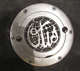
Switching gears.... Whenever I ride in a run-of-the-mill elevator, I think about how dull the design is compared to historic lifts I've used in other places. This beautiful Otis logo is a reminder of those elevators. Seen in the Memorial Union at the University of Wisconsin Madison.

If you were wondering what the Otis logo looks like these days, here it is. The ultra-generic one at left is the stand-alone version, while the slightly less generic version at right is the co-branding with the parent company, United Technologies Company.
The stand-alone logo seems particularly bad to me -- the all-caps setting doesn't even allow the variety of letter shapes seen in the lower case. And neither one has the class of the script in the globe in the old logo.
Love that old Otis logo.
ReplyDelete