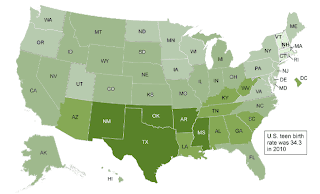
Don't look for the key on this map, and think of what impression you get of the data.

Personally, I get the impression that the gray states have the lowest rate of teen pregnancy, which is quite wrong. (Here's the key.)
But I think it's more likely a problem with the color coding, which is done as if the map were showing a five-point Likert scale, where the mid-point is neutral, when in actuality one end is bad and the other is good.
To me, the best way to represent that kind of data is one continuous gradation of the same color. My tendency is to have the color that represents the highest rate -- the one that has the most of whatever the map is talking about -- be the darkest, and the tint that represents the lowest rate be the lightest, since it has the least of it:

The New England states are still a bit hard to spot, but isn't that more immediately readable, even without a key?


1 comment:
I can't actually say that I would've interpreted it as you did without the key, but I can see how a person would!
Pearl
Post a Comment