
One of the first things I saw on Twitter this morning was this county-by-county map of the U.S., made by a guy named Gabe Guidarini who says he worked on it for five months. His bio states that he's a Zoomer (Gen Z member), proud American, political analyst, and mapmaker, so that's all I know about his interests and biases.

(Click to enlarge.)
Nonetheless, his thoughts are shown in short in the full map here and in detail in the Twitter thread linked above, which has some close-ups of areas of the map, full definitions of his terms, and a bit on his methodology.
I will give just one close-up area plus the key:


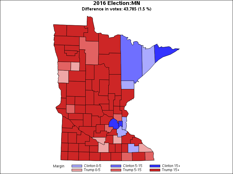
This close-up covers the two parts of the country I'm most familiar with, New York and Minnesota, plus the parts between and nearby.
Check out those little purple pockets — at a quick glance, I think they're all counties where college towns are located (except in Vermont, whooboy, look at Vermont, is that accurate?). I find it amusing that Tompkins County in New York (home of Cornell University) is the only purple county in "lefty" New York, but it's surrounded by three Populist counties, a Right Wing Populist county, and two Conservatives (one of which is my home county... it's nice that he labeled my home county only as Conservative instead of Right Wing Populist, unlike all the other counties just to the west and south of it).
The major cities in New York, on the other hand, are all red (plus a couple of counties along the Hudson).
As far as his Minnesota assessment goes... It's a bit odd that the county that makes up the Congressional district that literally elected an icon of "purple" is shown as red (Ilhan Omar's Hennepin County, home to Minneapolis). And before that they elected Keith Ellison! I think some of his greater Minnesota assessments are a bit off, too, though if he's basing it mostly on how the counties voted in the 2016 presidential election, it's understandable. (They voted pretty differently in 2008 and 2012. We'll see what happens on November 3.)
If 2016 is a major part of Guidarino's basic formulation, his Wisconsin assessments seem off. Counties that went for Clinton in that state are sometimes colored Populist green. But one thing is sure: there are no liberals in Wisconsin. Hmm.
As far as definitions go, Guidarini's differentiation of Democratic Socialism and Social Democracy is a bit fast and loose. Basically, it's Bernie, Cornel West, and the Squad in purple, with Elizabeth Warren, Sherrod Brown, Kamala Harris, and Chris Hayes in red. Get it?
Yellow, though — which represents Liberalism — goes all the way from Beto to Bloomberg, so I don't know about that. And while there may not be many yellow counties on this map, the ones that are have a lot of population (they seem to mostly be suburban areas of very large cities).
Populism, not surprisingly, seems to lack coherence. The symbols and photos he uses there are mostly unrecognizable to me except Joe Manchin and an old Bull Moose Party logo, which I don't think have a lot in common. I guess these are the "give me economic goodies if I'm white but take away women's rights" and "government is bad" people? Yeah, yeah, Robert La Follette, how does he fit into that?
Liberal Conservative isn't really worth talking about because, as you can see, it has hardly any counties on the map. Mostly Mormons, I guess.
Then he gets into the two that have lots of land mass, in his estimation: Conservative and Right Wing Populism. Conservatives are generally represented by the people who started out being anti-Trump but are now pro-Trump (Cruz and Rubio) plus Ben Shapiro, while you can imagine who's in the RWP camp (oh, why leave it to your imagination: Pat Buchanan, Michelle Malkin, Tucker Carlson, and a MAGA hat for good measure).
One funny thing in the Twitter thread is all the young commenters who can't get over the fact that Guidarini used blue to represent conservatives and red for lefties, which is, of course, the color assignments used in the rest of the West to this day and was the familiar color-coding in the U.S. (especially red!) for more than a hundred years.
Oh, and they were also perplexed that purple could mean anything but half way between red and blue. Talk about living in the present and being literal-minded.
For me, using green to represent this weird idea of populism is more jarring than anything.

2 comments:
He certainly gets downstate Illinois right, except, maybe, for the red county on the western border — I just don’t know what that one’s about. The purple is Champaign County — U of I. And the further south you go from there, the more right-wing things get.
That red county is whatever part of Illinois is in the Quad Cities, it looks like - Rock Island?
Post a Comment