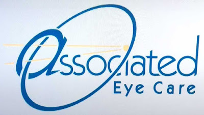
Let's say you run a business that helps people with bad eyesight. What would you do for a logo?
Well, why not design one that's completely occluded and hard to read?

Yeah, that's it: Make the first letter a lowercase shape that's enlarged. Choose a different font than the rest of the word. Run a meaningless swoosh through it that's the same shape as the letter's curve, and while you're at it, put a couple of yellow lines in there, too.
And that's not even mentioning that this version of the typeface used (Kabel) is so badly drawn, it would make its creator, Rudolph Koch, wish he'd never designed it.
Tuesday, July 11, 2017
A Cruel Logo
Posted at
7:54 PM
![]()
![]()
Categories: Life in the Age of the Interweb
Subscribe to:
Post Comments (Atom)


No comments:
Post a Comment