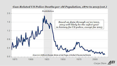
I've got two graphs for today. First, from the Washington Post, the population-adjusted number of police deaths per year since the 1870s:

Prohibition, not surprisingly, was an outlier when it comes to police deaths, but note that the number of deaths was heading up significantly even before Prohibition. And also that the valley of the oh-so-safe 1950s is actually slightly higher than the one in the past few years. The peak around 1975, while notably high compared to the trends before and after it, would have been good years at any time before 1935 or so.
Then the number of drinks per week consumed by each American over 18:

Yes, that graph shows the top 10 percent consuming almost 74 drinks a week, more than 10 a day. (Now that's what I call a power law distribution.) The ninth decile, people who consume in the 80- to 90-percent range, average about two drinks a day, which seems an acceptable amount.
I wonder what that top 10 percent looks like when it's broken down by percents: How high can the top 1 percent go without dying of alcohol poisoning?
That chart is from Boing Boing. The Washington Post recently ran an article about the recent trend toward more alcohol-related deaths (over 30,000 per year, a number that's up 37 percent since 2002). Those deaths do not include car crashes or other physical mishaps caused by drunkenness — just deaths from things like cirrhosis and alcohol poisoning. If you add in "accidents" and homicides, the number triples to 90,000 a year.
Thursday, December 24, 2015
Two Graphs, Ups and Downs
Posted at
5:09 PM
![]()
![]()
Categories: Facts I Never Knew
Subscribe to:
Post Comments (Atom)


No comments:
Post a Comment