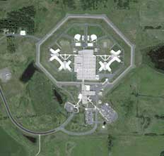
Emily Badger, writing for The Atlantic, brings us the work of grad student Josh Begley, who has compiled Google satellite images of all the prisons and jails on U.S. soil. He has begun to load them to his own site, prisonmap.com.
We have less than 5 percent of the world’s population but we're responsible for a quarter of the world’s prisoners, held in almost 5,400 facilities. I wonder how many of them are private, for-profit enterprises these days?
Badger also points out a fact I learned a few years ago, but which I appreciated being reminded about:
These rural prisons often house urban prisoners, in the process transforming both the communities where these facilities are located and the neighborhoods from which their inmates came. This population shift has serious consequences for urban, often minority communities, in part because the Census has long counted prisoners where they’re locked up, not where they’re from, costing inner-city communities resources and political capital (this practice, often called “prison-based gerrymandering,” began to gain greater attention during the 2010 Census).
 |
| Doesn't this one look a bit like a skull and cross bones? |
Update: Yet another Boing Boing post pointing to a use of satellite photography as geography... this time a study that finds a strong correlation between the number of trees and the average income in a neighborhood.


2 comments:
Prison gerrymandering. Yet another nasty big of social engineering of which I was unaware. So frustrating!
bit
Post a Comment