I picked up this postcard back at the No Coast Craft-O-Rama back in December. I liked it, of course, or I wouldn't have bought it. But over the past month I've been liking it more and more, and wanted to share it.
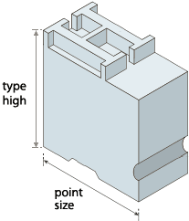
The letterpress artist, Rebecca Ann Rakstad of Rar Rar Press, printed it in two passes. The second pass was Goudy Heavyface in red ink, but the first -- now, that's the interesting part: Rebecca turned some wood type upside down and inked the bottoms to create the squares. Her slogan is "Type High Since 2004." If you're not into letterpress, you may not realize that's more than a description of Rebecca's state of mind. "Type high" refers to the height of the block of type, including the relief cutting of each letter. Anything you want to print, whether a letter, dingbat, piece of woodcut art or block of color has to be type high or it won't print -- or if it's taller than type high, it'll wreck the press.
Friday, January 23, 2009
Type High
Subscribe to:
Post Comments (Atom)


2 comments:
Neat. I just saw "Proceed and Be Bold!" about letterpress artist Amos Paul Kennedy, Jr....and it was really fun to see the presses and get a little bit of a sense of the process. Highly recommended.
One of my earliest posts on this blog was about Amos Kennedy and a class I took with him. I'd love to see the film.
Post a Comment