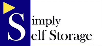
I was driving down the highway a few days ago, and saw a sign for a self-storage business named Simply Self Storage. Didn't have time to take a picture of the sign, though, being too busy driving.
Well, it turns out it's a national chain, so they've got a website and everything, and I got a copy of the logo there.
As regular readers know, I have a hangup about logos that try to share one large letter between two (or more) words. To their credit, the designers of the Simply Self Storage logo didn't do that. If they had, it would have looked like this:
And we would all have known who to call when we needed a place to tuck away our little pointy-eared friends for safe-keeping. And maybe an imp or two, just to be sure.
But even with just one word attempting to make a visual connection with the large initial capital, it still doesn't really read clearly. The big white S in a blue block is just too far away and too different from the smaller black letters of "imply."
Why not just put in all the Ss, and let the big S stand alone, like this? It's still not a great logo, but at least it's easily readable.
Saturday, May 30, 2009
What Would Elrond Do?
Posted at
4:27 PM
![]()
![]()
Categories: Drive-by Shooting
Subscribe to:
Post Comments (Atom)


2 comments:
Everything is wrong with this logo – starting with the name. I've never quite gotten "self storage"...but maybe that's just me? Why not "Stuff Storage"? (But that is NEVER simple)..
Going back into the closet now.
I agree that "self storage" is a completely inane term for renting space to store your life's detritus. When the term first surfaced (seems like that was about 20 years ago?) I made fun of it all the time.
But the more you hear a term, no matter how stupid, the more it just becomes part of the verbal furniture, I guess, so I've stopped noticing it.
Post a Comment